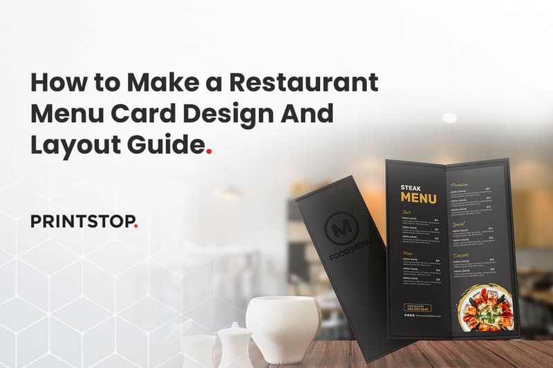
How to Make a Restaurant Menu Card - Step by Step Design Guide with Layout Tips (2026)
A restaurant menu card is a structured presentation of dishes, descriptions, and prices designed to guide customer choices while reflecting a restaurant’s brand and experience. It serves as the primary communication tool between the kitchen and the diner, setting expectations before the food even arrives.
Understanding how to make a menu card for restaurants effectively matters because it directly influences sales and shapes the overall perception of your dining establishment. In 2026, creating a seamless experience across both physical and digital formats is essential.
This comprehensive guide covers everything you need to know to create the perfect menu. We will explore step-by-step creation methods, various layout options, and core design principles. You will also learn about menu psychology, practical print sizing tips, and how to avoid common mistakes that could cost you revenue. By the end of this article, you will have a clear roadmap for designing a menu that looks professional and drives profitability.
What Makes a Good Restaurant Menu Card?
A well-designed menu does more than list food items. It works as a silent salesperson that guides customers through your offerings while shaping their dining experience. When layout, structure, and branding work together, the menu becomes easier to explore and helps diners make decisions quickly.
Clarity and Readability
The first priority of any menu is readability. Fonts should be clear, appropriately sized, and supported by comfortable spacing so customers can scan dishes easily. When text is easy to read, diners spend more time choosing what they want instead of struggling to understand the menu.
Logical Grouping of Categories
A strong menu follows the natural flow of a meal. Categories typically move from starters to mains, followed by desserts and beverages. This simple structure helps customers browse options in a familiar order and reduces the feeling of being overwhelmed by too many choices.
Brand Alignment
Your menu should reflect the identity of your restaurant. Design elements such as colour's, typography, and layout should match the overall brand personality. Whether the restaurant feels modern, rustic, luxurious, or playful, the menu should communicate the same character.
Balanced Layout & Visual Flow
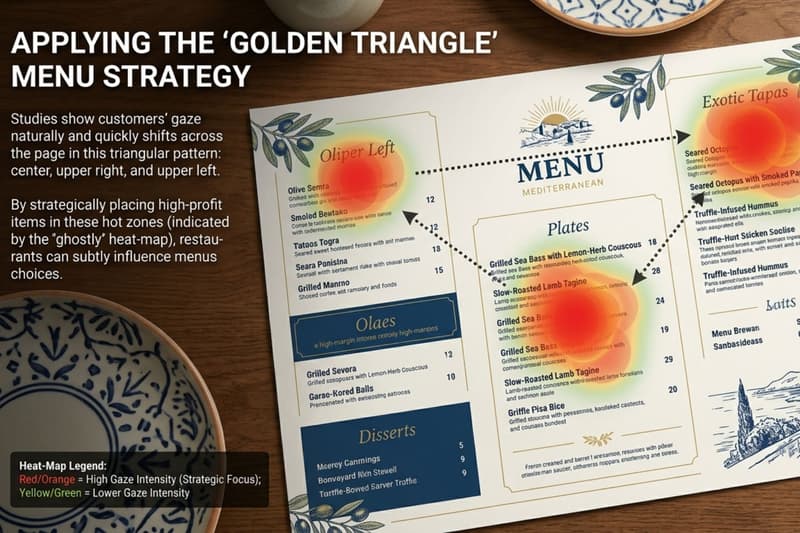
A balanced layout helps guide the customer’s eyes across the menu naturally. Proper spacing prevents clutter and makes each section easier to navigate. Designers often use the Golden Triangle principle, where the eye typically moves from the centre of the page to the top right and then to the top left, making these areas ideal for placing signature or high-margin dishes.
Key Takeaways
A well-designed menu acts as a silent salesperson by guiding customers toward key dishes while reinforcing the restaurant’s brand identity and dining experience.
Clear structure and readability are essential; organised categories, proper spacing, and legible fonts help diners navigate options quickly.
Choosing the right menu format, size, and layout ensures the content fits comfortably while remaining easy to scan at the table.
Strategic menu engineering, such as highlighting profitable or signature dishes, can influence ordering behaviour and improve sales.
Visual design elements including colours, icons, photos, and white space should enhance the layout without creating clutter.
Effective descriptions and transparent pricing help customers understand dishes clearly and build trust during the ordering process.
Regular testing, proofreading, and updates based on customer behaviour ensure the menu remains clear, relevant, and profitable.
Let’s get started with the Steps to design the perfect menu card!
Step 1: Define Your Restaurant Concept & Target Audience

Before you understand how to design a menu for a restaurant, it is important to clearly define your restaurant’s concept and the audience you want to attract. Your menu should reflect the style of dining you offer and align with the expectations of your customers.
Identify Your Restaurant Type
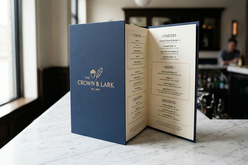
The type of restaurant you operate plays a major role in how your menu is structured. Casual Dining Restaurants usually feature relaxed layouts and simple descriptions, while Fine Dining Establishments tend to use refined typography, curated dish lists, and a more elegant presentation.
Similarly, a Café menu often focuses on beverages, quick bites, and lighter items, whereas a Family Restaurant typically offers a broader selection that appeals to different age groups and preferences.
Your positioning also affects pricing and design style. Luxury Restaurants often highlight premium ingredients and limited selections to emphasise exclusivity, while budget-focused establishments prioritise variety, clear pricing, and easy-to-read menu formats that support quick decision-making.
Understand Your Customer Demographics
Knowing who sits at your tables dictates how you present your food. Consider the age group, spending behaviour, and overall expectations of your patrons. A menu designed for busy professionals on a lunch break will differ from one targeting families, college students, or international tourists.
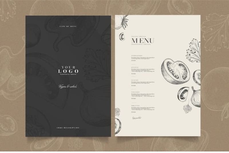
Align Design Choices With Brand Identity
Once the restaurant type is defined, the menu design should reflect the restaurant’s overall brand identity. Elements like typography, colours, layout, and material should work together to create a consistent look that matches the dining experience.
Fonts: Typography sets the tone of the menu. Elegant serif fonts suit fine dining, while clean sans-serif fonts work well for cafés and casual restaurants. Readability should always remain the priority.
Color Palette: The colour scheme should align with the restaurant’s branding and interior style. Warm tones create a welcoming feel, while neutral palettes often convey sophistication.
Layout Style: Menu layouts should match the dining style. Fine dining menus often use minimal layouts with generous spacing, while casual restaurants may use clearer sections and highlights.
Paper Choice: The material also affects brand perception. Textured or thicker paper creates a premium feel, while laminated menus are better suited for high-traffic environments.
Step 2: Choose the Right Menu Format and Size
Selecting the correct physical dimensions and folding style is crucial for functionality. Your choice will depend entirely on how many items you serve and the table space available.
Common Restaurant Menu Sizes Explained
Restaurants typically use standard print sizes to ensure easy production and consistent presentation.
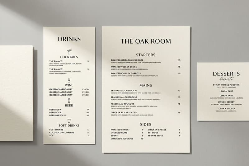
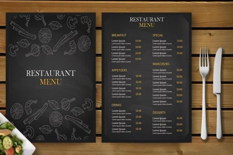
A4 (210 × 297 mm): One of the most common sizes for restaurant menus. It offers enough space for multiple sections while remaining easy to handle.
A3 (297 × 420 mm): Used for larger menus or foldable formats where more items need to be displayed clearly.
DL (99 × 210 mm): Slim and compact, often used for drinks menus, dessert menus, or quick-service restaurants.
Custom Dimensions: Some restaurants prefer unique sizes to match their brand style or table setup.
Choosing the right size depends on the number of items, table space, and the overall dining style.
Single-Page vs Multi-Page Menus
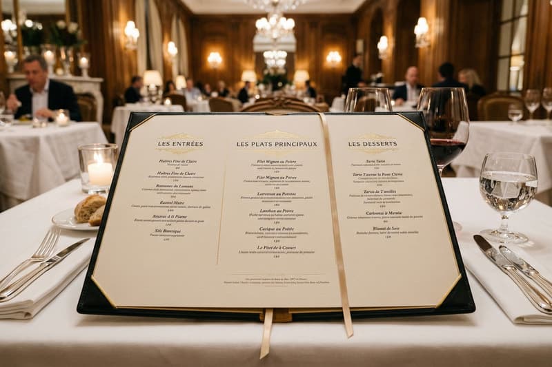
Single-page layouts work best when simplicity is the goal, allowing diners to see everything at a glance. Multi-page menus are necessary for fine dining or venues with extensive offerings that require breathing room.
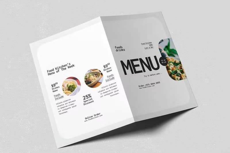
Bi-Fold and Tri-Fold Menu Formats
Single-page menus are ideal for smaller restaurants, cafés, and takeaway outlets. They allow customers to quickly view all options at once without flipping pages. This format works best when the menu has a limited number of items.
Multi-page menus are more suitable for larger restaurants or fine dining establishments that offer extensive selections. Multiple pages help organise categories clearly and prevent overcrowding on a single sheet.
Portrait vs Landscape
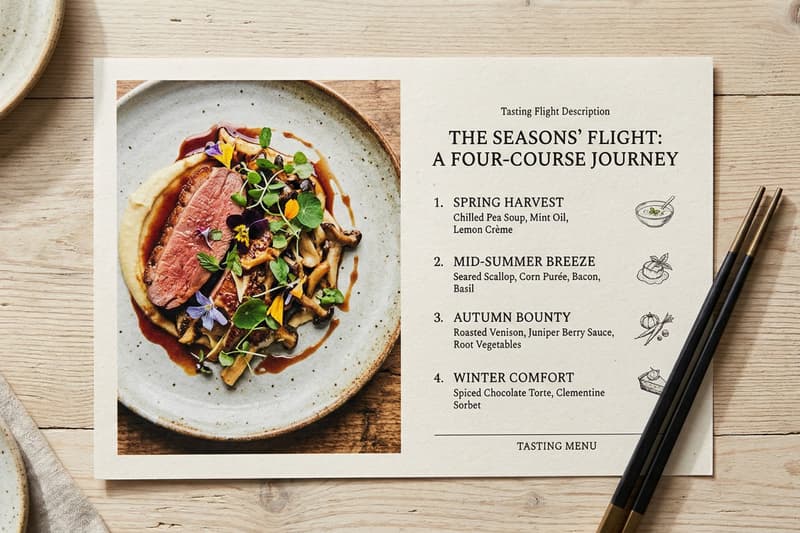
Portrait orientations are traditional and generally easier for guests to hold at a crowded table. Landscape formats can offer a unique visual presentation, particularly for tasting menus or landscape-oriented photography.
Printed Menus vs QR or Digital Menus
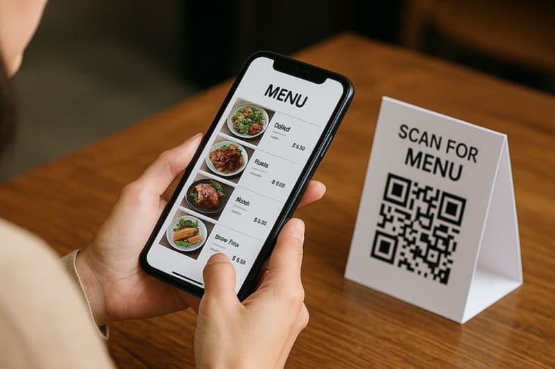
Restaurants today often combine traditional printed menus with digital options.
Printed menus provide a tactile experience and remain easier for customers to browse without using a phone.
QR or digital menus allow restaurants to update items, prices, and availability instantly without reprinting. They are also useful for reducing printing costs and supporting contactless ordering.
Many restaurants now use both formats together to balance convenience and flexibility.
Comparison Table of Formats & Sizes
Step 3: Plan Your Menu Content Structure
The next step is organising the actual content. A clear structure helps customers navigate dishes easily and makes the menu feel less overwhelming.
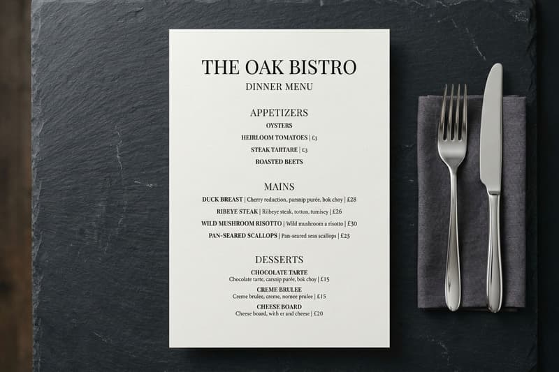
Break Items Into Clear Categories
Organise your offerings into distinct, familiar sections such as Starters, Mains, Desserts, and Drinks. This logical grouping helps hungry customers find exactly what they want without unnecessary searching.
Limit Menu Length to Avoid Decision Fatigue
Offering too many options can overwhelm customers and slow down table turnover. Keep your list focused on your best dishes to streamline the ordering process and maintain high kitchen efficiency.
Apply Basic Menu Engineering Principles
Menu engineering focuses on placing high-margin or signature dishes in areas where customers naturally look first. Items placed near the top of a section, in highlighted boxes, or in visually prominent areas tend to attract more attention. Strategic placement can subtly guide ordering choices.
Decide on Special Sections
Adding dedicated sections such as Chef’s Specials, seasonal dishes, or combo meals can create interest and encourage exploration. These sections also allow restaurants to highlight limited-time items or promote dishes with higher profitability.
Step 4: Design the Menu Layout for Maximum Impact
Establish a Clear Visual Hierarchy
A well-designed layout helps customers navigate the menu effortlessly while highlighting key dishes. By organising information visually and maintaining balance, restaurants can make menus easier to read and more persuasive.
Choose Readable and Complementary Fonts
Select font combinations that are easy to read and match the restaurant’s style. Typically, headings may use a decorative or brand font, while body text should remain simple and legible, usually between 11–14 pt for menu items.
Maintain Consistent Colour Strategy
Use colours that provide high contrast against your text for maximum legibility. Ensure your palette aligns with your brand guidelines and always account for print bleed lines during the design phase.
Use White Space to Improve Focus
Empty space on the page is just as important as the text itself. You must avoid clutter to give your dishes room to breathe, which inherently makes the menu look more premium.
Guide Eye Movement Strategically
Place key items and best sellers in high-visibility zones on the page. You can also use visual cues to indicate levels of spice or highlight dietary restrictions to guide the customer safely.
Restaurants can also use tabletop tent cards to highlight best sellers, chef’s specials, or limited time offers directly on dining tables. These small promotional displays help draw attention to profitable dishes even before guests open the menu.
Types of Menu Layouts
Restaurants can choose from different menu layout styles depending on their concept, number of items, and dining experience. Each layout structure presents dishes differently and shapes how customers explore the menu.
Traditional Course-Based Layout
This structure follows the standard dining experience by categorising dishes strictly into starters, mains, and desserts. It provides a familiar and comforting navigation path for guests who want a complete meal.
Highlighted Feature Layout
This approach uses boxes, contrasting colours, or prominent placement to draw immediate attention to high-profit signature dishes. It is a highly strategic design choice meant to steer diners towards specific, premium choices.
Tasting Menu Layout
Often presented on a single, elegant card, this layout lists a predetermined sequence of small courses without individual prices. It builds anticipation for a curated culinary journey and works perfectly for fine dining.
Set Menu / Combo Layout
This format bundles multiple items together for a single price to offer perceived value and speed up the ordering process. It is incredibly effective for lunch rushes, special events, or fast-casual environments.
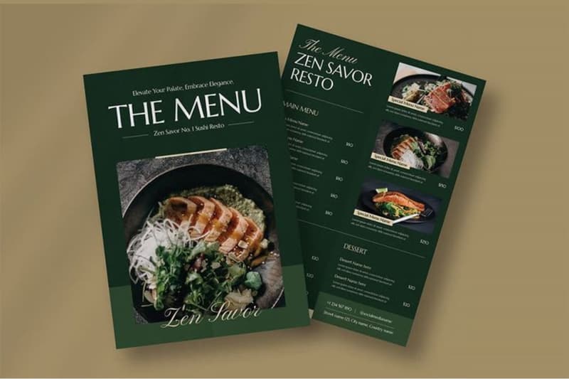
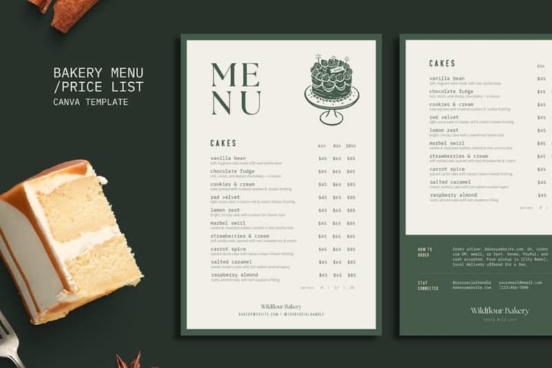
Visual-Led (Photo-Focused) Layout
This design relies heavily on vibrant, high-quality images of the food to stimulate the appetite and drive sales. It is highly popular in fast food, cafes, and family restaurants where diners order with their eyes.
Ingredient/Category-Based Layout
Instead of traditional courses, this layout organises dishes by core ingredients like chicken, seafood, or plant-based options. It helps diners with specific preferences or dietary requirements find their ideal meal quickly.
Apply Colour Psychology to Shape Customer Decisions
The colours you choose can actively influence how hungry your customers feel and what they decide to order.
Red and Warm Yellows: These colours are known to stimulate appetite and create a sense of energy and urgency. They are commonly used in fast-paced, casual dining environments where bold and lively branding works well.
Black and Deep Tones: Dark colour palettes are often linked with luxury and sophistication. They help increase the perceived value of dishes and are frequently used in upscale or fine-dining restaurants.
Green: Green is closely associated with freshness, nature, and healthy living. It works particularly well for organic cafes, vegetarian restaurants, and health-focused dining concepts.
Earth-Inspired Shades (Brown, Terracotta, Olive): Warm, earthy tones create a comfortable and inviting atmosphere. They are well suited for cafes, bakeries, and restaurants with rustic or natural themes.
Neutral and Minimal Palettes: Soft grey's, whites, and muted tones convey simplicity and elegance. These palettes are often used by modern or minimalist restaurants to maintain a clean and refined visual style.
Step 5: Write Effective Menu Descriptions & Pricing
Once the menu layout is ready, the next step is writing clear and appealing dish descriptions along with well-presented pricing. Good descriptions highlight key ingredients and preparation style, while smart pricing placement keeps the menu easy to read and encourages confident ordering.
Keep Dish Descriptions Concise and Informative: Focus on outlining the key ingredients and the specific preparation style. Diners want to know what they are eating without having to read a long, complicated paragraph.
Use Language That Enhances Appeal Without Overdoing It: Choose words that make the food sound appetising and fresh. However, you must avoid exaggerated wording that might set unrealistic expectations or sound pretentious.
Apply Smart Pricing Presentation: Align your prices neatly at the end of the description rather than using a hard dotted line. This subtle approach avoids visual distractions and stops customers from simply shopping by price.
Keep Pricing Clear and Transparent: Ensure there are no hidden costs or confusing layouts regarding side dishes and add-on's. Clear pricing builds trust and prevents awkward conversations when the bill arrives.
Step 6: Add Illustrations & Photos
Visual elements can make or break your menu by instantly grabbing a diner's attention. However, it is crucial to strike the right balance between showcasing your dishes and maintaining a clean, professional design.
When to Use Food Photography?
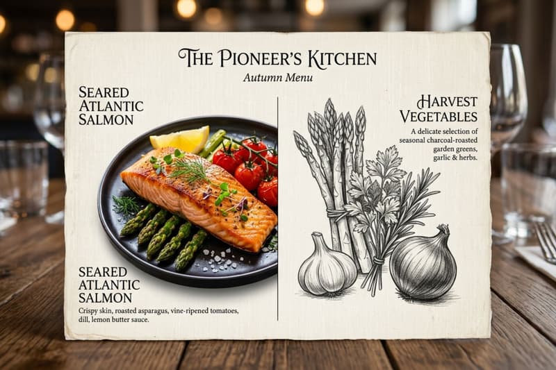
Including pictures of your food can be highly effective if done correctly.
They are best for casual dining or visual-heavy menus where customers expect to see exactly what they are ordering.
High-quality photos can bridge language barriers and help tourists make quick decisions.
They work exceptionally well for highlighting signature desserts or visually impressive cocktails.
When to Avoid Overusing Images?
Sometimes, leaving out photos is the smarter design choice.
Premium or fine-dining settings usually rely on elegant typography rather than pictures to convey quality.
Poorly lit or amateur photos can make even the most delicious food look unappealing.
Overcrowding the page with images leaves little room for proper descriptions and creates a chaotic layout.
Use Icons for Dietary Information
Small symbols are incredibly useful for modern diners.
They quickly identify vegetarian, vegan, and gluten-free options without cluttering the text.
Icons are perfect for indicating spice levels or warning customers about common allergens like nuts.
Using standard, easily recognisable symbols keeps the design clean and customer-friendly.
Decorative Elements That Enhance, Not Distract
Subtle design touches can elevate the entire look of the card.
Elegant borders can help frame the page and keep the content contained neatly.
Minimalist separators are great for dividing distinct categories like mains and side dishes.
Subtle background textures can add depth and a premium feel without interfering with readability.
Step 7: Proofread, Test & Optimise
Before sending the menu to print, check readability from about one to two feet away. This reflects how customers actually hold and view the menu at the table. It is also important to test a printed sample under the restaurant’s real lighting conditions, since fonts that look clear on a bright screen may become difficult to read in dim dining environments.
You should also ask front-of-house staff to review the menu because they interact with customers daily and can identify confusing descriptions or pricing layouts. After the menu is introduced, observe ordering patterns and update the design when needed by removing unpopular items or adjusting dishes based on changing food costs.
Restaurant Menu Design Trends in 2026
Minimalist layouts Clean and uncluttered designs are dominating the dining scene by allowing the food to speak for itself. These layouts use ample white space and simple typography to create a sophisticated, highly readable experience.
QR integrated menus Physical menus now frequently feature a small, scannable code in the corner for instant access to dynamic content. This allows restaurants to link directly to daily specials, allergen matrices, or high-resolution photo galleries.
Sustainable paper menus Eco-conscious dining has pushed establishments towards using recycled materials and biodegradable inks for their printed collateral. This trend appeals directly to environmentally aware consumers while adding a rustic, earthy charm to the table setting.
Premium textured prints Restaurants are moving away from standard flat paper and opting for embossed or debossed finishes that feel luxurious to the touch. This tactile experience instantly elevates the perceived value of the dishes before the customer even reads the descriptions.
Soft-touch lamination This protective finish gives the menu card a velvety, high-end feel while shielding it from spills and greasy fingerprints. It provides excellent durability for busy venues without sacrificing the premium aesthetic.
Hybrid print + digital menus Venues are combining the best of both worlds by handing guests a beautifully crafted physical drink or dessert list alongside a digital main course menu. This approach maintains a tactile dining experience while keeping the core food offerings incredibly easy to update.
Tips to Design and Print a Restaurant Menu
Follow these practical printing guidelines to ensure your final product looks professional and lasts a long time.
Keep the layout clean and easy to scan: Avoid overcrowding the page. Use clear section headings, balanced spacing, and logical grouping of dishes to guide the customer’s eye.
Choose readable fonts and appropriate sizes: Limit yourself to one or two font families and ensure the text remains legible under restaurant lighting conditions.
Use images carefully: Include high-quality visuals only when they enhance appeal. Too many photos can make the menu look cluttered.
Select the right paper and finish: Decide between matte, glossy, laminated, or textured paper based on durability needs and brand positioning.
Proofread before printing in bulk: Check spelling, alignment, margins, and colour accuracy to avoid costly reprints.
Consider durability and maintenance: For frequently handled menus, opt for thicker paper stock or protective lamination.
Conclusion
Learning how to create a menu card requires careful planning and strategic execution. You must start by clearly defining your target audience to ensure the tone and aesthetic align with your brand. Once the concept is established, plan a logical content structure that highlights your most profitable items without causing decision fatigue.
Choose a physical format that suits your service style, and apply proven layout principles to guide the diner's eye smoothly across the page. Always take the time to test the readability and presentation under actual restaurant lighting before committing to a large print run. By following these steps, you can produce a professional menu that enhances the dining experience and drives consistent revenue.
FAQs
Q. What size should a restaurant menu card be?
A. The most common sizes are A4 or A3 for standard dining. Drink and dessert lists often use a tall DL format. The ideal size depends entirely on your total number of dishes and how much table space is comfortably available for your guests.
Q. Should menus include photos?
A. Photos work brilliantly for casual dining, fast food, and cafés, provided they are professionally shot. However, upscale and fine-dining restaurants should generally avoid images, relying instead on high-quality typography and evocative descriptions to communicate the value and presentation.
Q. What font size is best for menus?
A. Dish titles should generally be between 12 and 14 points, while the descriptive text should sit around 10 to 12 points. Always ensure the font is large enough to be easily readable in the specific lighting conditions of your dining area.
Q. Is a printed menu better than QR menus?
A. Both have distinct advantages. Printed menus offer a tactile, welcoming experience that many diners prefer. However, QR menus are highly hygienic, easy to update instantly, and cost-effective. The best approach in 2026 is a hybrid model offering both options to guests.