Matte vs Glossy Finish Which Print Finish Should You Go For in 2026
When it comes to printing, the finish you choose can influence how your content is perceived. A matte finish is smooth and non-reflective, giving a clean, professional look with minimal glare and better readability. In contrast, a glossy finish is shiny and reflective, enhancing colour vibrancy and visual impact.
Making the right call depends on a few core factors, like the actual purpose of the print, the lighting environment where it’ll be seen, how much it will be handled, and the overall design style of your brand. If you're handing over assets to a client or building collateral for your own business, that tactile feel matters just as much as the visual.
In this guide, we are breaking down everything you need to know to make the best choice in 2026. We’ll cover the pros and cons of both, give you a detailed side-by-side comparison, look at the best use cases for specific products, break down the cost differences, and highlight the print trends dominating this year.
Matte Vs Glossy Finishes - A Quick Comparison!
Which is best, glossy or matte?
If you just need the fast facts before we get into the details, here is how the two finishes stack up. Keep this in mind as you plan out your print assets.
Key Takeaways
Think about the lighting first because a glossy finish under bright office bulbs will just reflect a bunch of glare and hide your design.
Matte is the move if you want that high-end "boutique" feel while glossy is your best friend for making photos look hyper-realistic and sharp.
Never put a QR code on a high-gloss surface since the reflection usually messes with the camera and stops people from actually visiting your link.
If your project is heavy on text and fine print you should stick with matte to keep everything crisp and easy on the eyes.
Glossy paper definitely handles moisture and spills better but it also shows every single fingerprint the second someone picks it up.
Business cards usually work better in matte so people can actually write a quick note on them without the ink smearing all over the place.
You can actually use both by choosing Spot UV which gives you a professional matte background with shiny accents exactly where you want them.
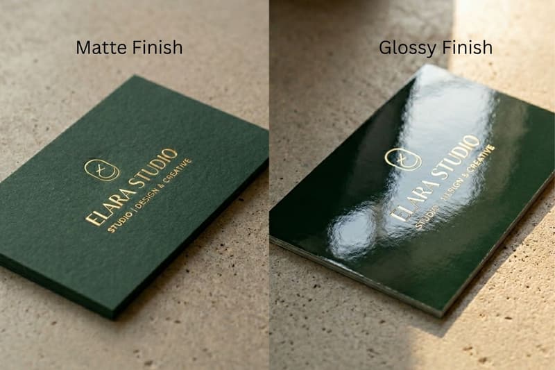
What Is a Matte Finish?
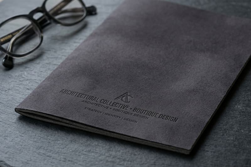
A matte finish has a specialised coating that diffuses light rather than reflecting it. When light hits the surface, it scatters, creating a smooth, flat look that feels incredibly sophisticated. Texturally, it often feels slightly velvety or perfectly smooth to the touch, depending on the exact paper stock.
During the printing process, the matte coating is applied to seal the ink, ensuring the colours stay true without any added shine. You’ll typically see this finish dominating industries like corporate finance, luxury real estate, boutique agencies, and minimalist tech brands.
Pros
Tactile "Soft-Touch" Experience: Matte isn't just a look; it's a feel. It provides a velvet-like, organic texture that encourages people to keep the item in their hands longer, creating a physical connection to your brand.
Uninterrupted Visual Clarity: By neutralising light interference, matte ensures your design is visible from every angle. This is crucial for environments with multiple light sources, like trade shows or retail displays.
Timeless Aesthetic Appeal: Matte carries a "gallery" quality. It feels more like fine art than a commercial handout, making it the go-to for high-end lookbooks and minimalist designs that want to avoid looking "cheap" or "plastic."
Post-Print Versatility: Beyond just writing on it, matte surfaces are better for secondary processes like foil stamping or embossing, as the lack of shine allows these premium details to truly stand out.
Cons
The "Muted" Effect: There is a technical limit to how deep your blacks can go. On matte, the ink is absorbed more into the fibers, which can result in a loss of fine detail in very dark, complex shadows.
Surface Vulnerability: Without an added laminate, matte paper is more "open." It can act like a sponge for liquids or pick up "burnishing" marks (shiny spots) if it rubs against other papers in a stack.
What Is a Glossy Finish?
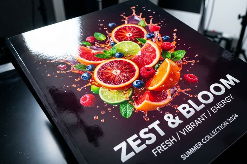
A glossy finish is all about creating a slick, high-shine surface that reflects light like a mirror. This finish uses an ultra-smooth coating that traps the ink, allowing light to bounce directly off the pigment.
This optical effect tricks the eye into seeing richer, deeper, and more highly contrasted colours. It’s a staple in retail, food and beverage marketing, entertainment, and any industry where visual stimulation is the primary goal.
Pros
Cinematic Depth and Dimension: Glossy coatings act like a lens for your ink. It creates a "liquid" look that adds a sense of 3D depth to photography, making jewelry, cars, or food look almost hyper-realistic.
Inherent Weather Resistance: The coating used for gloss is naturally more non-porous. It creates a basic moisture barrier that can survive a few raindrops or a damp countertop better than an unprotected matte sheet.
Instant Psychological "Hook": Gloss triggers a high-energy response. It mimics the look of a smartphone screen or a high-def monitor, which feels familiar and "up-to-the-minute" for younger, tech-savvy audiences.
High-Volume Resilience: Because of the UV-curing process, glossy prints are often "slippery." This makes them easier to sort, stack, and mail in high volumes without the pages sticking together or creating friction heat.
Cons
The "Mirror" Obstacle: In brightly lit environments, glossy prints can reflect light like a mirror. This glare may obscure important elements such as logos, contact details, or calls to action, reducing readability and visual clarity.
Maintenance Heavy: Glossy surfaces tend to show fingerprints, smudges, and scratches more easily. For materials that are frequently handled, this can cause the print to appear worn or less polished over time.
Glossy Finish vs Matte Finish: Detailed Comparison
Choosing the right finish means looking past just how it looks and thinking about how it actually performs in the real world. Let's break down the core decision-making factors.
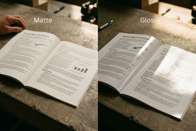
Readability & Text-Heavy Designs
If you are writing a strong copy, you want people to actually read it. Matte takes the win here effortlessly. Without light bouncing into the reader's eyes, paragraphs of text are soothing to read. Glossy finishes cause eye strain when reading long blocks of text due to the constant micro-adjustments needed to avoid glare.
Colour Vibrancy & Visual Impact
For sheer visual power, glossy is the undisputed champion. It acts almost like a magnifying glass for your ink, making every hue look more intense. Matte works beautifully for pastel, muted, or minimalist colour palettes, but if you need a vibrant red car or a juicy burger to look irresistible, gloss brings that image to life.
Lighting & Display Environment
Think about where the print will live. If a poster is hanging under the harsh fluorescent lights of a convention centre, a glossy finish will turn into a giant mirror, obscuring your message. Matte absorbs that light, ensuring your design is visible from anywhere in the room.
Paper Type and Weight
Glossy finishes often feel a bit lighter or thinner even on the same weight of paper because of how the smooth coating flexes. Matte finishes, especially when combined with a thick cardstock, tend to feel heavier, more substantial, and structurally rigid in the hand.
Printing Process
Both finishes usually start with similar base paper, but the final step changes the game. Glossy finishes use an aqueous or UV coating cured quickly to create that hard shine. Matte finishes use a different sealant that settles flat. Because of this, matte can sometimes take slightly longer to fully dry and set without offset.
Handling & Durability
If the item is going to be shoved in pockets or handled by dozens of people, glossy offers better protection against moisture and spills. However, it will look smudged very quickly. Matte won't show the smudges, but standard matte (without a protective laminate layer) can get scratched or scuffed at the edges over time.
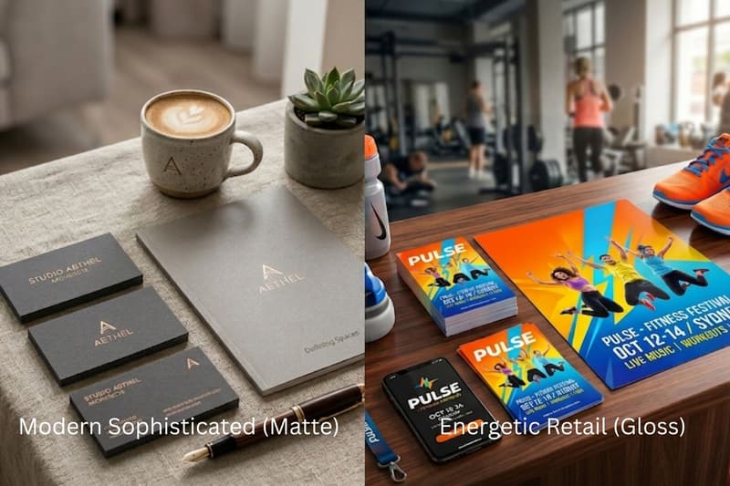
Brand Tone & Perception
Your finish communicates your brand's personality before a single word is read. Building an agency? Matte tells the client you are modern, strategic, and sophisticated. Glossy tells the client you are energetic, bold, and focused on high-impact retail or consumer action.
Best Finish by Print Product
To get the best ROI on your printing, you have to match the finish to the specific medium. Here is a breakdown of what works best for the most common print products on the market.
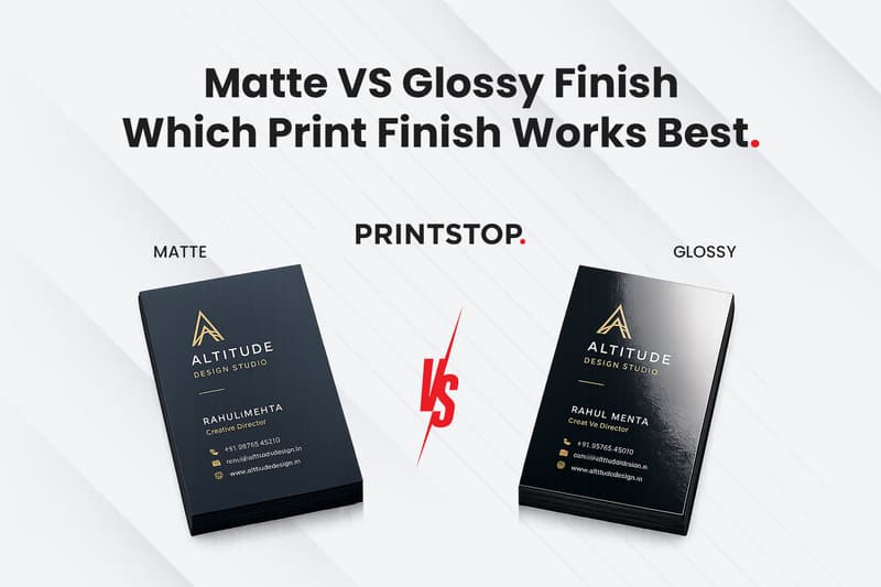
Matte vs Glossy for Business Cards
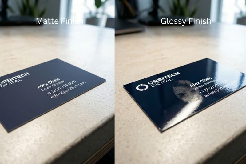
W'hen networking, your business card is your first impression. Matte is generally the superior choice here. It feels premium, aligns with modern professional aesthetics, and crucially, allows the recipient to write a quick note on the back. Glossy cards can feel a bit dated and show smudges the second you hand them over.
Matte vs Glossy for Brochures
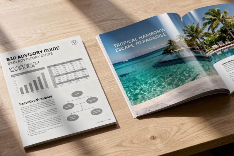
Brochures are an interesting middle ground. If your brochure is an informational guide for a B2B service heavy on text, charts, and data, it keeps it readable and professional. But if it’s a travel brochure showing off a tropical resort, or a product catalogue showing physical items, glossy makes those images sing.
Matte vs Glossy for Posters
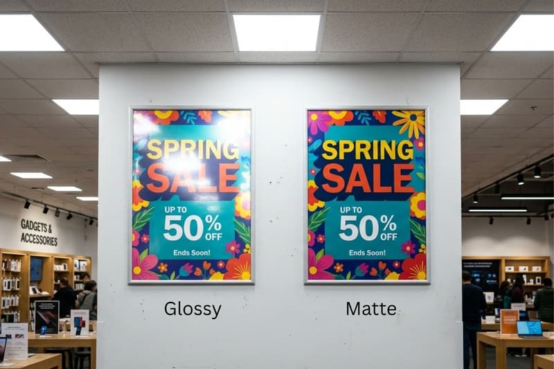
Posters are usually viewed from a distance, meaning lighting plays a massive role. If the poster is indoors under strong lighting, matte ensures the message isn't lost in a blind spot of glare. However, for outdoor promotional posters or movie posters where you want maximum colour depth and weather resistance, glossy is the standard.
Matte Finish vs Glossy Finish for Flyers
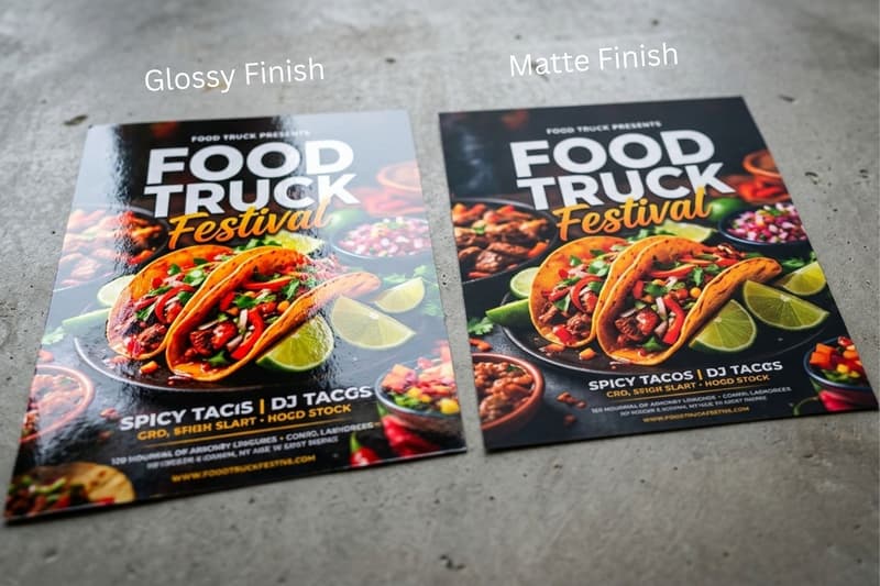
Flyers are usually temporary, high-volume marketing tools designed to grab attention fast. Matte or glossy which is better? Glossy is almost always the winner for standard promotional flyers. The shine makes the graphics pop as someone is walking by, and the coating makes the thin paper feel a bit more substantial when handed out on the street.
Matte vs Glossy for Photo Prints
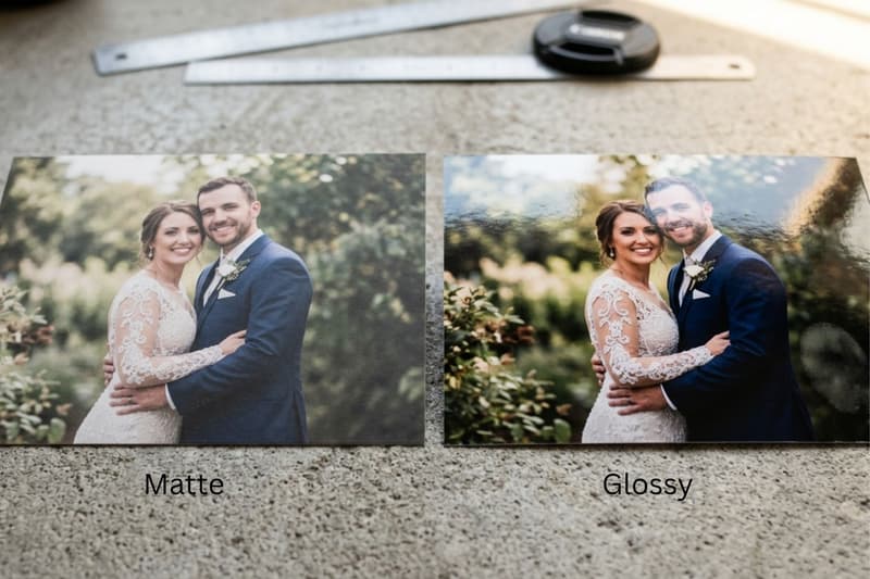
For or standard family photos or fast snapshots, glossy is the traditional go-to because it makes the colours crisp and lifelike. But for fine art photography, wedding portraits, or gallery displays, matte is the undisputed king. It removes distracting reflections and gives the photograph a timeless, artistic depth.
Cost Comparison: Which Is More Expensive?
In most Indian print shops, standard matte and glossy finishes cost nearly the same because both use similar base paper and coating processes. For example, basic visiting cards typically range from ₹160 - ₹300 for 100 cards depending on GSM and printer.
Costs increase when premium finishes are added. Soft-touch matte, textured matte, or velvet laminations can raise prices to ₹350 - ₹700+ per 100 cards, while UV gloss or special coatings can also increase costs for higher shine and protection. Bulk orders usually reduce the per-card cost significantly.
Print Finish Trends in 2026
Printing is evolving fast, especially with how we integrate physical assets with digital systems. Keeping in mind the glossy and matte differences, this year is seeing a massive shift toward tactile experiences that stand out in a screen-heavy world.
The Rise of Soft-Touch Matte: Standard matte is great, but soft-touch (or suede) matte is everywhere in 2026. It adds a physical, velvety texture to the paper that makes people physically hold onto the card or brochure longer.
Matte Spot UV Combinations: Why choose one? The biggest trend right now is using a soft matte base and adding high-gloss Spot UV coating just on the logo or key text. It creates an incredible contrast that looks highly custom.
Sustainable Coatings: Eco-friendly finishes are no longer optional. Water-based matte and glossy coatings that don't use harmful plastics or disrupt the recycling process are dominating the market as brands push for green initiatives.
QR-Enabled Prints Demand Matte: With automation linking physical prints to digital funnels, QR codes are on everything. A glossy finish can cause glare that prevents a phone camera from scanning the code. Because of this, matte is becoming the mandatory choice for tech-integrated marketing.
Final Verdict
Glossy paper and matte paper, which one should you actually go for? The final decision depends entirely on your design's purpose, where it will be viewed, and the brand style you are trying to project.
Choose a matte finish if you are designing text-heavy materials, need to avoid glare under harsh lights, want to project a modern, premium brand tone, or expect people to write on the paper.
Choose a glossy finish if you are printing high-resolution photography, want your colours to look as vibrant and punchy as possible, or need a bit of extra durability against fingerprints and moisture on temporary promotional items.
Now, knowing the difference between matte and glossy finishes, there’s no wrong answer, just the right tool for the job!
FAQs
Q. Is matte or glossy better for business cards?
A. It depends on your industry. Matte is perfect for consultants or lawyers wanting a sophisticated, writeable surface. Glossy suits high-energy fields like real estate or retail where vibrant photos need to "pop." For a truly elite impression, Spot UV visiting cards combine both, offering a matte base with glossy accents, which is ideal for creative directors and premium brands looking to stand out.
Q. Which finish is easier to write on?
A. Matte finishes are significantly easier to write on because the surface remains slightly porous, allowing standard ballpoint and gel pens to grip and absorb into the paper. In contrast, glossy finishes have a slick, non-porous chemical coating that causes ink to bead up or smear instantly, making it nearly impossible to leave a legible, lasting mark.
Q. Does glossy make colours brighter?
A. Yes, glossy finishes are designed to maximize visual impact. The reflective coating traps ink on the surface rather than letting it soak in, which enhances contrast and makes colors appear significantly deeper and more vibrant. This "liquid" effect is why photographers and retail brands prefer gloss to make their high-resolution imagery look as punchy and lifelike as possible.
Q. Which finish looks more professional?
A. Professionalism depends on your industry. For corporate, B2B, or luxury branding, matte is currently the industry standard for a modern and understated look. However, glossy can look incredibly professional in high-end retail, entertainment, or fashion photography contexts where a "high-gloss" magazine aesthetic is required to communicate energy and premium quality. It’s all about matching the finish to your brand's voice.
Q. Is matte more expensive than glossy?
A. Generally, standard matte and glossy finishes are priced similarly at most commercial printers. The cost only begins to fluctuate when you move into premium territory. For instance, a luxurious soft-touch matte lamination or a thick, high-build UV gloss will increase your per-unit price. Always consult with your printer about the specific coating weight to ensure your budget aligns with your vision.
Q. Can you combine matte and glossy finishes?
A. Absolutely, and this is a top design trend for 2026 known as "Spot UV." This process involves applying a flat matte finish to the entire document and then layering a high-shine, raised glossy coat onto specific elements like logos or headlines. This creates a stunning physical and visual contrast that makes key parts of your design literally pop off the page.