12 Packaging Trends: What Indian Brands Need to Know
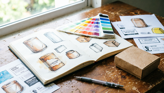
Packaging is no longer just a container. It is the first thing a customer sees, touches, and judges, often before they read a single word about the product inside. In 2026, the brands winning on shelf and in feed are the ones treating packaging as a brand channel in its own right.
The packaging design trends defining 2026 are being shaped by four converging forces: sustainability mandates driving material innovation, technology turning packaging into an interactive touchpoint, and a broad consumer reaction against visual noise pushing brands back toward human craft and cultural authenticity.
This guide covers all twelve packaging design trends in detail, what each one is, why it matters for Indian brands, how to identify whether it fits your brand, and how to adopt it without a full redesign budget.
Key Takeaways
Sustainability is moving from a preference to a compliance requirement for Indian brands.
Cultural authenticity, regional art, vernacular type, Indian craft traditions, is a global differentiator, not just a local one.
Many of the most effective new packaging trends require low investment to adopt.
You do not need to adopt all twelve. One trend, executed with quality materials and honest intent, is enough.
D2C brands have the most to gain from unboxing design and artist showcase trends, both generate earned media at low cost.
Latest Packaging Trends at a Glance
A fast reference before the detail. Use the effort column to shortlist which trends are worth reading first for your current budget and timeline.
The 12 Packaging Design Trends Shaping 2026
Each trend below covers what it is, why it matters for Indian brands specifically, what it looks like in practice, who it is best suited for, and how to start adopting it without breaking the budget.
1. Hyper-Sustainable Packaging
Eco-conscious packaging has moved past the token kraft mailer. In 2026, sustainability is a visible brand value built into every material choice, compostable films, bioplastics, recycled paper, and mono-material designs that reduce waste at every stage of the product lifecycle.
Why it matters for Indian brands: Government regulations on single-use plastics are tightening across India, and urban consumers are actively checking for green credentials before purchasing. Brands that have already made the shift are ahead of an incoming compliance requirement, not just a consumer preference.
Key features: bio-based and recycled materials, minimal ink usage, no mixed-material laminates, plastic-free and refill-compatible formats, on-pack certifications clearly displayed.
Best for: FMCG, food and beverage, personal care, Ayurvedic and wellness, D2C brands targeting sustainability-conscious consumers.
How to adopt it on a budget: start with one material swap, kraft paper over plastic, paper tape over plastic tape, or a compostable mailer. Display the certification visibly on the pack. Availability varies by material type, confirm with your printer before committing to a specific substrate.
Tip: Transparency builds credibility. State your material certification clearly on the label. Vague claims without proof are increasingly dismissed by informed buyers.
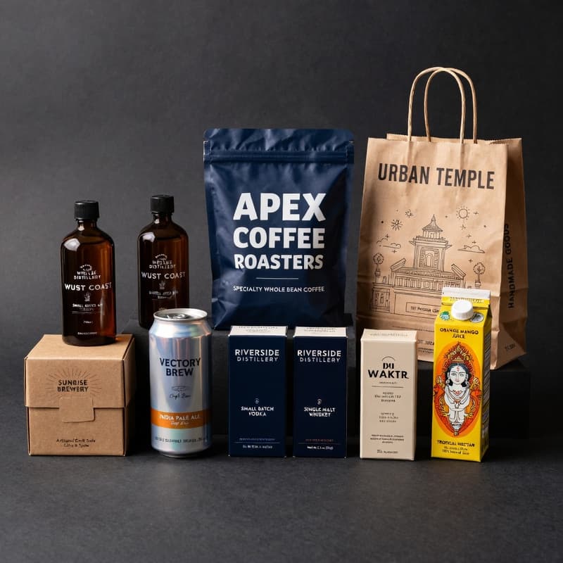
2. Unboxing as a Brand Moment
Packaging engineered as a choreographed reveal sequence, interior prints, layered compartments, hidden messages, and tactile cues that make opening feel like an experience worth filming and sharing on Instagram or YouTube Shorts.
Why it matters for Indian brands: D2C brands have turned unboxing into a low-cost marketing channel. User-generated unboxing content is earned media that paid ads cannot replicate. The investment is in the design, not the media spend.
Key features: interior brand messaging or artwork, custom tissue paper and inserts, theatrical but frustration-free opening mechanics, personalised thank-you cards, packaging designed to be kept rather than discarded.
Best for: D2C beauty, fashion, gifting, wellness, food packaging, and subscription box brands. Any brand where the delivery is the first physical touchpoint with the customer.
How to adopt it on a budget: a printed tissue paper layer and a handwritten-style insert card create a memorable first impression at minimal cost. Full interior printing is the next investment level. See custom gift boxes and packaging inserts.
Tip: Design the opening sequence before you design the exterior. The reveal is what customers film and share.
3. Hyper-Localisation and Cultural Provenance
Packaging that draws authentically from regional art forms, traditional motifs, local languages, and Indian cultural heritage as the primary brand identity, not as decoration applied over a global template.
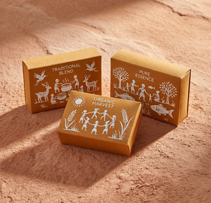
Why it matters for Indian brands: Tier 2 and Tier 3 consumers respond strongly to packaging that reflects their own identity. In export markets, genuine Indian visual heritage differentiates powerfully against global minimalism. The design language is already there, it just needs to be used with intention.
Key features: hand-drawn regional illustrations, vernacular or Devanagari typography, festival and seasonal design variants, local colour symbolism, references to Indian craft traditions including Madhubani, Warli, Kalamkari, and block printing.
Best for: food and spices, Ayurvedic and natural products, handicrafts, regional speciality goods, brands targeting both domestic and NRI markets.
How to adopt it on a budget: commission a local artist for one illustration or motif and use it consistently across one product line before expanding. Custom print runs with supplied artwork allow you to bring any regional design language to print without a minimum on complexity.
Note: Draw from your own heritage or partner authentically with artists from that tradition. Authentic expression builds trust. Decorative borrowing erodes it.
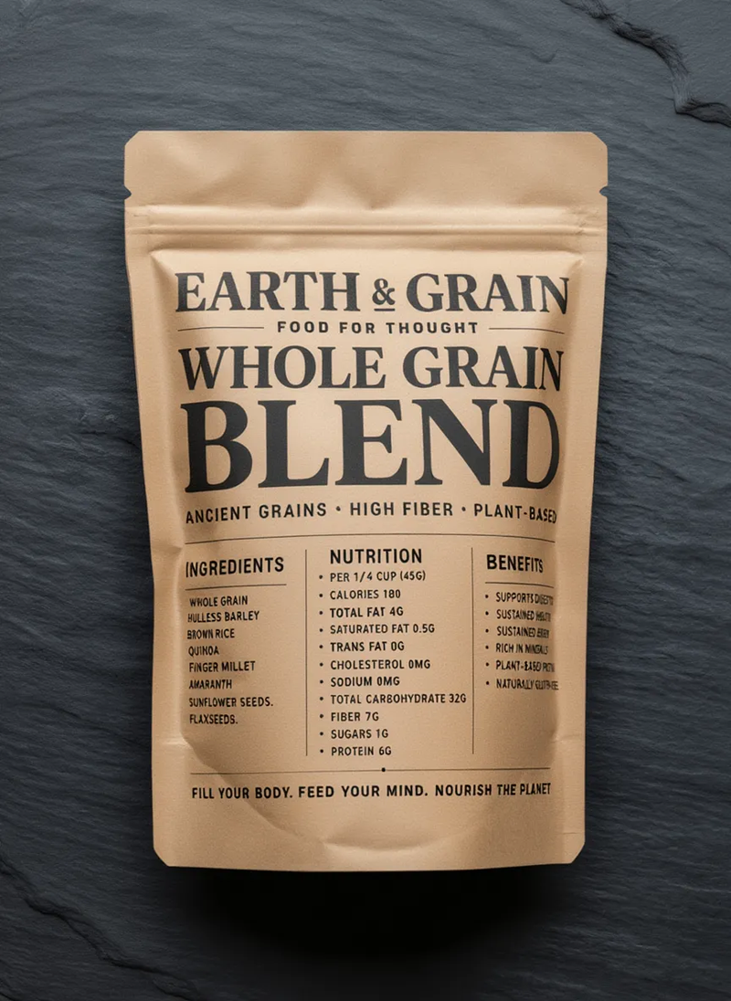
4. Ultra-Clean Industrial
Stripped-down geometry, sharp lines, and typography built purely for clarity. Inspired by utilitarian design philosophy, less but better. Every element earns its place; nothing is decorative.
Why it is catching on: consumers are turning toward packaging that feels honest and trustworthy after years of visual noise and over-designed FMCG shelves. Clean industrial design reads as confident and credible, particularly in health and tech categories.
Key features: block-like structures, muted palettes of soft beige, grey, and off-white, clean sans-serif fonts limited to one family, rounded ergonomic corners, matte or subtly textured finishes.
Best for: tech gadgets, health products, homeware, minimalist beauty and wellness lines, supplements.
How to adopt it on a budget: one neutral-toned stock, a single clean sans-serif typeface, and a streamlined layout. No full redesign needed, a label refresh achieves the effect.
Tip: Use one sans-serif font and a neutral background. The discipline of the layout does the work, not the number of elements.
5. Narrative Pop
Bold editorial layouts where typography and long-form copy become the design itself, borrowing the energy and confidence of magazine and poster design and applying it to product packaging.
Why it is catching on: brands with strong origin stories are using every panel to communicate. In a crowded FMCG aisle, packaging that makes consumers stop and read creates longer dwell time and stronger brand recall. For D2C brands, every delivery is a brand communication.
Key features: dense editorial layouts, long-form brand storytelling, oversized headlines and pull quotes, layered type hierarchy, confident brand voice, structured grids that guide the reader through the pack.
Best for: D2C food brands, craft coffee and beverages, lifestyle and wellness brands, any brand with a strong founder story, origin narrative, or social mission.
How to adopt it on a budget: one panel styled like a magazine spread or a bold headline layered with brand copy is enough. No illustration budget required, this is a typography-first trend.
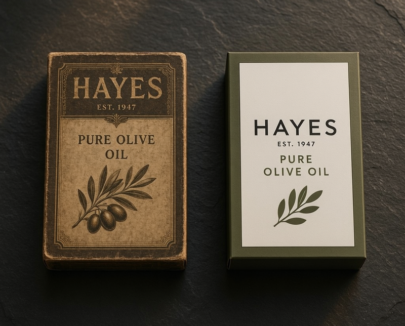
6. Apothecary Aesthetic
Structured grids, authoritative serif typography, and botanical or archival imagery referencing heritage and craft. Once limited to medicinal bottles; now used across food, wellness, and lifestyle as a signal of intentional production and trusted quality.
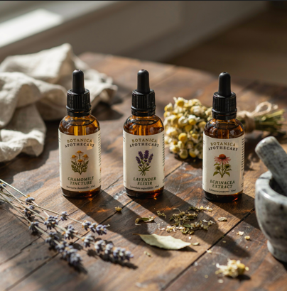
Why it is catching on: consumers associate this aesthetic with trustworthiness, premium quality, and careful production, all the signals that premium Indian brands want to project. It works particularly well for Ayurvedic and natural product categories where credibility is essential.
Key features: grid-based layouts, earthy palettes with deliberate colour accents, serif typography, hand-drawn botanical or archival imagery, embossing or letterpress finishes, textured stocks.
Best for: Ayurvedic and wellness products, organic food, teas and spices, craft spirits and beverages, artisan pantry goods.
How to adopt it on a budget: a clean grid and a strong serif font deliver the foundational look before investing in premium finishes. Swap the botanical illustration seasonally to create limited editions without a full redesign. Custom label printing on textured stocks supports this aesthetic from small runs upward.
Tip: Create seasonal limited editions by swapping the illustration or ingredient panel per batch. Customers collect them, which builds loyalty and drives repeat purchases.
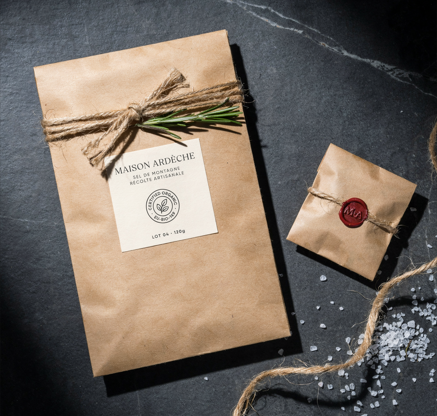
7. Imprinted
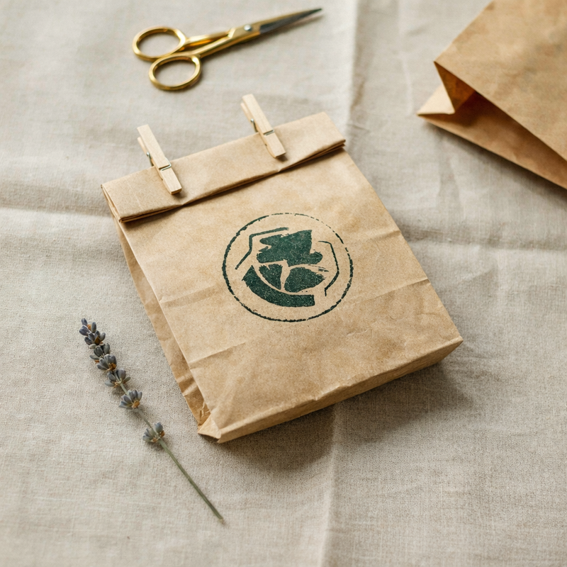
Hand-stamped, pressed, and imperfect textures that celebrate craft and the human touch over digital precision. The irregularity is the point, it signals that a person made this, not a machine.
Why it is catching on: consumers want packaging that feels personal and made with care, a direct contrast to the mass-produced uniformity of large FMCG brands. For small Indian brands, this is a competitive advantage rather than a limitation.
Key features: textured surfaces from stamping or pressing, imperfect irregular forms, grainy inks, earthy palettes of green, brown, and charcoal, rough serif or typewriter-style fonts, uncoated or recycled stock.
Best for: artisan food brands, homegrown skincare, organic and natural products, small-batch goods, regional and craft brands.
How to adopt it on a budget: a rubber stamp, handmade block, or seasonal motif differentiates packaging batch by batch without large investment. Custom kraft packaging and paper bags are available at low minimum order quantities, allowing for seasonal rotation.
Tip: Imperfection is the point. Slightly uneven stamping or irregular ink coverage signals handmade authenticity, do not try to correct it.
8. Future Nostalgia
A blend of retro visual cues and futuristic aesthetics, surreal imagery, highly polished reflective materials, curvy bold fonts, and pastel or neon palettes that feel simultaneously vintage and forward-looking.
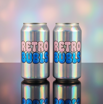
Why it is catching on: Gen Z grew up on vintage aesthetics through short-form video but demands innovation. This trend delivers familiarity and surprise at the same time, which is why it performs strongly on social feeds where packaging doubles as content.
Key features: surreal and dreamy imagery, bold rounded or bubble typography, reflective or iridescent finishes, retro colour palettes updated with neon or chrome accents, emoji-inspired graphic elements.
Best for: beverages, snacks, beauty, streetwear-adjacent products, youth-focused D2C brands, limited-edition drops.
How to adopt it on a budget: a retro-style font with a neon or iridescent accent colour achieves the core effect without a full structural redesign. Iridescent and holographic finishes are available on select substrates, confirming availability for your specific pack format before committing.
9. Artist Showcase
Commissioned artwork from local, independent, or established artists used as the primary packaging design element, turning every pack into a limited-edition work of art and every artist collaboration into an earned media moment.
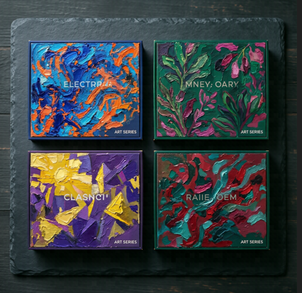
Why it is catching on: packaging that looks like art creates emotional connection, press coverage, and social sharing that paid media cannot replicate. For Indian brands, commissioning local artists also connects brand identity to community and regional heritage.
Key features: artwork-first design, wide-ranging styles from painterly to abstract to street art, minimal or integrated typography, designs that feel one-of-a-kind and culturally connected.
Best for: any brand wanting shelf differentiation. Particularly effective for D2C, limited editions, and brands wanting to highlight community or regional ties.
How to adopt it on a budget: commission a local or emerging artist for one limited run. Rotate artists across seasons or product lines to build collectibility and loyalty over time. Supply print-ready artwork files, your printer can advise on format and colour profile requirements.
Tip: Treat packaging like a gallery. Limited artist collaboration drops create urgency, collectibility, and earned media all at once.
10. Pure Steel
Metallic finishes, chrome, brushed steel, and polished aluminium, that signal durability, modernity, and a futuristic edge. At its best, pure steel packaging looks like it was engineered rather than designed.
Why it is catching on: steel and chrome convey trust and forward-thinking simultaneously, two brand signals that Indian consumers in tech and premium personal care respond strongly to. The finish also performs well in social content where reflective surfaces catch light.
Key features: realistic metallic finishes from mirror chrome to brushed steel, condensed or monospaced fonts suggesting engineered precision, cool grey and silver palettes with controlled neon or high-contrast accents, angular structures.
Best for: beverages, cosmetics, electronics accessories, premium personal care, energy drinks.
How to adopt it on a budget: a single metallic foil element, reflective ink strip, or silver-toned label achieves the effect without fully metallic packaging.
Tip: Add one metallic element such as a hang tag, foil seal, or strip rather than covering the entire pack. Impact without inflated cost.
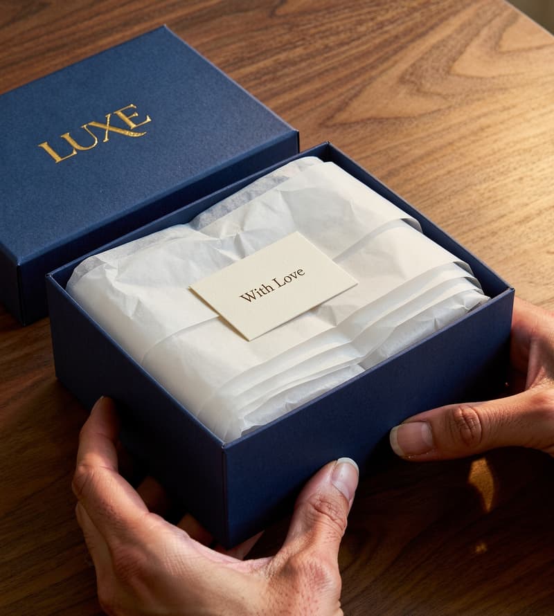
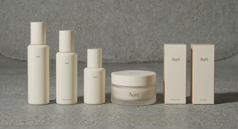
11. Lightweight Luxury
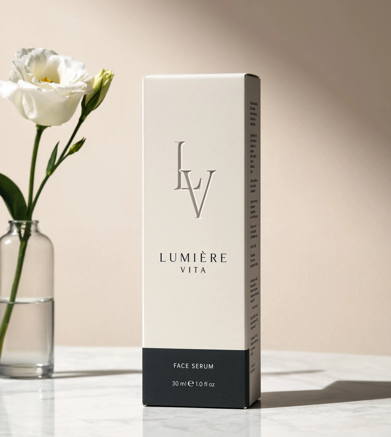
Premium packaging that signals quality through design precision, tactile finish, and material intelligence rather than physical weight and excess material. The luxury is in the craftsmanship, not the heft.
Why it is catching on: physical weight as a signal of luxury is being replaced by material efficiency, a shift that also reduces shipping costs and environmental footprint at the same time. For premium Indian brands, it offers a way to signal quality without the cost and logistics of traditional heavy packaging.
Key features: lightweight but premium-feel substrates, soft-touch or velvet laminate finishes, embossed or debossed details, restrained colour palettes, clean structural engineering that eliminates unnecessary material without reducing perceived value.
Best for: premium skincare, fragrance, jewellery, corporate gifting, any brand positioning itself as luxury without the cost and weight of traditional heavy packaging.
How to adopt it on a budget: a soft-touch laminate finish on an otherwise standard box transforms perceived quality at a modest cost premium over standard gloss.
12. Inclusive and Accessible Packaging
Packaging designed for usability across all abilities, ergonomic openings, high-contrast typography, tactile cues, and features that help people with low vision or limited dexterity use products without assistance.
Why it is catching on: inclusive design is shifting from a compliance checkbox to a market expansion strategy. Brands that design for accessibility reach more customers and build longer-lasting loyalty across age groups and ability levels.
Key features: oversized tear strips, high-contrast or hyper-legible typefaces, NaviLens or high-contrast QR codes scannable from a distance, ergonomic grip structures, clear uncluttered information hierarchy.
Best for: pharmaceutical packaging, senior care products, FMCG with broad demographic reach, food brands targeting families across age groups.
How to adopt it on a budget: start with font contrast and label hierarchy. A legible typeface and clear information layout has no cost premium to implement and immediately improves the experience for a broader range of customers.
Why Packaging Design Matters More Than Ever for Indian Brands?
The packaging category has not changed this fast in decades. Material science, digital technology, and a broad shift in consumer expectations have converged in a way that makes 2026 a genuinely different moment, not just an incremental update on what came before.
Indian brands are in a particularly strong position. The country has one of the most culturally rich design traditions in the world, a D2C market growing faster than almost any other, and a regulatory environment that is pushing the entire industry toward better material practices.
The 4Forces Reshaping Packaging
Sustainability: recycled papers, compostable films, and lightweight materials now carry bold colours and premium finishes. Eco-conscious is no longer plain kraft.
Material strategy: texture, weight, and finish signal quality and responsibility simultaneously. How a pack feels in the hand is a brand decision.
Technology: QR codes and AR markers turn packaging into an interactive brand channel, from product origin stories to reorder flows built into the label.
Human craft: hand-drawn textures, cultural references, and deliberate imperfection stand out in an AI-saturated design landscape.
How to Choose the Right Packaging Trend for Your Brand?
Not every trend applies to every brand, and trying to follow all twelve at once produces incoherent packaging. The right approach is to match one or two trends to three things: your brand personality, your budget, and your product category.
Match the Trend to your Brand Personality
Match the Trend to your Budget
Match the Trend to your Product Category
Two things that matter more than the trend
Stay true to your brand identity. A trend adopted without authenticity reads as imitation, not confidence.
Choose materials and print quality that make your designs hold up on shelves, in transit, and in the hands of customers. The best design fails on poor stock.
Is It Time to Update Your Packaging?
Packaging trends are not a reason to redesign every year. But there are clear signals that a refresh is worth the investment, and equally clear signals that you do not need one yet.
Update your packaging if
Your current design has not changed in more than two years.
Your packaging does not stand out in the category it competes in.
You are launching a new product line or entering a new market.
Your materials do not meet current sustainability expectations or upcoming regulatory requirements.
Competitors have visibly updated and are gaining shelf or feed attention.
You do not need a full redesign if
Your brand equity is strong and recognition is high.
A single element, typography, finish, colour, seasonal motif, or one insert, can refresh the feel without changing the identity.
Your current packaging already aligns naturally with one of the 2026 trends.
Conclusion
Clarity, personality, and authenticity are the three qualities connecting every trend on this list. Whether it is stripped-back industrial geometry, hand-stamped imperfection, or cultural storytelling, the signal is consistent. Brands that feel real and intentional win attention.
India's cultural richness, craft traditions, and D2C growth place Indian brands in a position to lead several of these trends rather than follow them. Hyper-localisation, artist collaborations, and unboxing experiences are not adaptations of global trends. They are areas where Indian brands can set the pace.
You do not need to adopt all twelve. Pick one that fits your brand, your budget, and your customer. Execute it with quality materials and honest intent. That is what stands out in 2026.