Visiting Card Sizes & Dimensions: Everything You Need to Know Before Designing One!
Visiting Cards are often the first physical impression of your brand. Its size plays a bigger role than most people realise. The moment someone holds your card, the dimensions affect how readable it feels, how premium it looks, and whether it fits neatly into a wallet or card holder.
Choosing the right visiting card sizes ensures your text stays clear, your logo breathes, and nothing feels cramped or oversized. From a printing perspective, correct proportions also reduce cutting errors and alignment issues, which directly impact the final finish.
What many designers overlook is that card sizes are not universal. Different countries follow different standards, and understanding visiting card dimensions upfront helps you design accurately and print with confidence, especially if your cards are being produced in bulk or across regions.
Understanding Visiting Card Dimensions
Before diving into design choices, it helps to understand what card dimensions really mean and how they shape the final output. Dimensions determine layout balance, spacing, and how information flows visually. Even a few millimetres can change how professional a card looks when printed.
At a basic level, dimensions influence readability, brand hierarchy, and how comfortably the card fits into everyday use. This is why understanding visiting card measurement is not just a technical step but a design decision.
Width x Height
Card measurements are always represented as width multiplied by height. The width refers to the horizontal length of the card, while the height refers to the vertical length. These values define the overall canvas you are designing on.
Most professional cards follow consistent aspect ratios so that logos, text blocks, and margins feel visually balanced. Sticking to standard proportions helps ensure your design looks intentional and aligns well with common business card sizes used by printers worldwide.
Landscape vs Portrait Orientation
Landscape orientation places the longer edge horizontally, while portrait orientation places it vertically. Landscape cards are more common because they feel familiar, are easier to scan quickly, and suit horizontal logo layouts.
Portrait cards, on the other hand, work well for minimalist designs, creative professionals, or brands that want to stand out subtly. Orientation choice affects how your content is read and how the card is handled, which is why it is often considered alongside overall business card measurements during design planning.
Sharp Corners Vs. Rounded Corners
Sharp corner cards are classic and widely used, especially in corporate settings where a clean, formal look is preferred. They align well with traditional layouts and standard cutting processes.
Rounded corners introduce a softer, more modern feel. They tend to last longer in daily use because they resist bending and edge wear. From a design standpoint, a rounded corner business card size needs slightly more attention to spacing so that text and logos do not feel crowded near the curves.
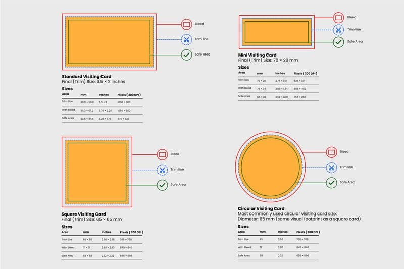
Bleed, Trim, and Safe Zone in Card Design
Bleed, trim, and safe zones are essential for both square and rounded cards, and even more important for circular visiting cards.
Bleed: It is the extra area added beyond the final card size. This area is trimmed off after printing and usually measures around 3 mm on all sides. Bleed ensures that background colours or images reach the edge without leaving white gaps.
Trim is the final cut line where the card is physically trimmed to its finished size. Any slight variation during cutting happens at this stage.
Safe zone is the inner margin where all important content like text and logos should stay. Keeping content inside this zone prevents accidental cuts and ensures clarity.
For rounded corner and circular cards, safe zones are even more critical because curved edges can eat into corners faster than expected. Proper bleed and spacing prevent cutting errors, maintain visual balance, and protect your design from looking unfinished.
Different Types of Visiting Cards and Their Dimensions
Visiting cards aren’t all built the same. Their shape and proportions can shift based on the brand personality, industry, and how much information needs to go on them. Choosing the right format affects visual balance, printing cost, portability, and of course, overall perception. Designers today experiment with shapes beyond the standard rectangle because unique forms help cards stand out instantly.
Standard Visiting Cards
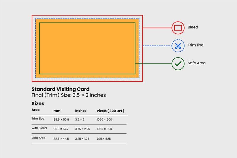
Standard visiting cards are the most common format used by professionals across industries. They balance space and elegance, offering enough room for contact details without looking crowded. Standard business card dimensions are about 3.5 x 2 inches and this layout works well for corporate identities, consultants, and entrepreneurs because it feels familiar and functions smoothly in wallets, files, and storage sleeves.
Standard formats also pair perfectly with printers who already follow standard business card size guidelines for accuracy and consistency.
Square Visiting Cards
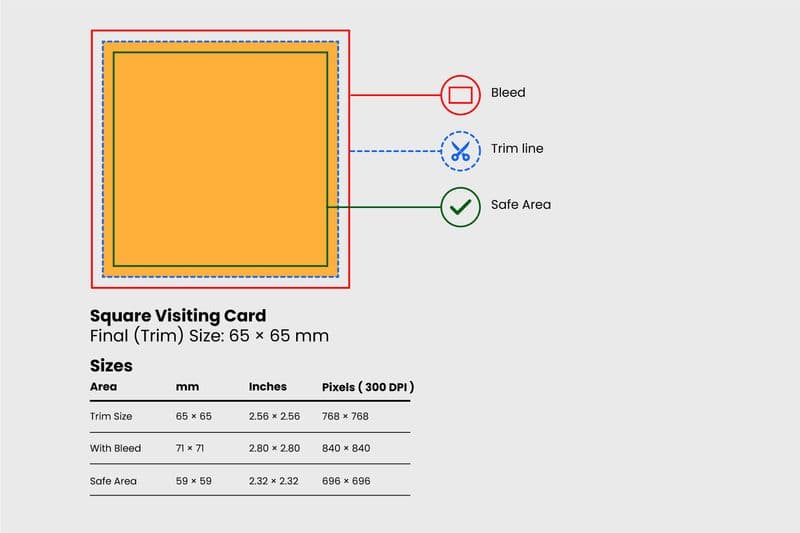
Square business cards feel modern and artsy. A popular example is the compact 65 × 65 mm layout, which creates a neat visual frame while breaking away from tradition. They’re loved by photographers, creative studios, salons, and boutique brands because the shape feels bold, memorable, and stylish. Square cards also demand clever spacing since the unique shape offers less horizontal width than traditional business card dimensions allow.
Mini Visiting Cards
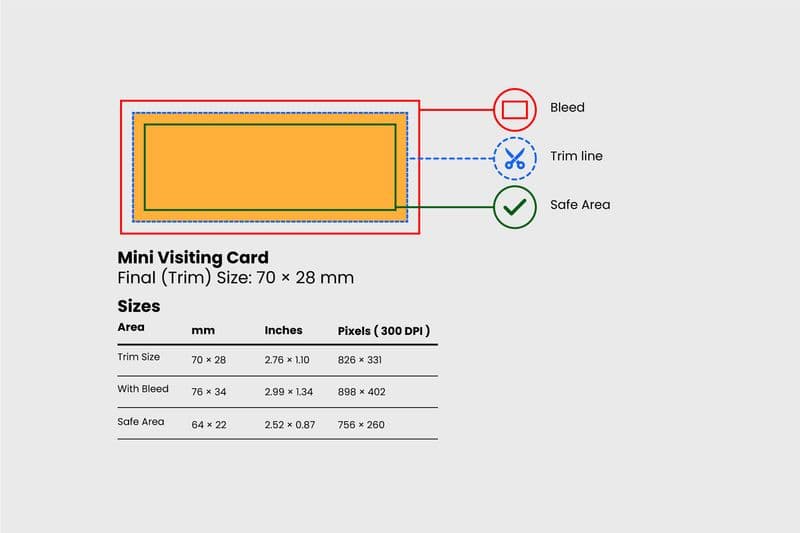
Mini cards are slim, smart, and intentionally minimal. A format like 70 × 28 mm is ideal when your focus is on subtle branding rather than detailed information. These slim business cards slide easily into pockets and packaging, making them great for product tags, thank-you messages, or compact marketing. Minimal space forces sharper design thinking, which is why these are trending among start-ups and creatives who want something fresh and practical.
Circular Visiting Cards
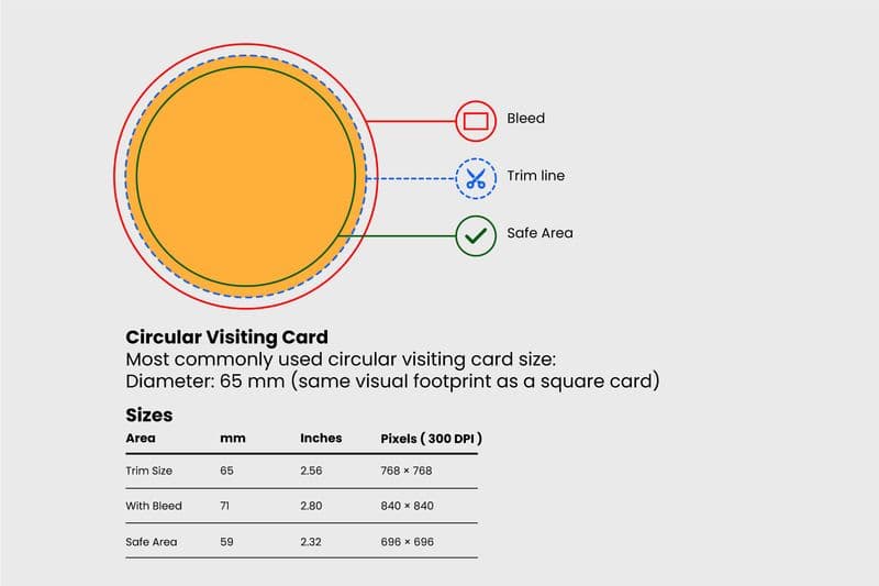
Circular business cards are all about luxury and impact. Their striking silhouette instantly catches the eye and feels premium in the hand. These work beautifully for fashion houses, jewellery brands, exclusive restaurants, or high-end consultants who value identity elevation.
Because traditional cutting machines are built for rectangles, circular cards rely on special trimming techniques to maintain perfect edges and preserve the intended feel of official business card sizes within a circular structure.
Business Card Sizes in Different Units in India
Designers in India switch between inches, centimetres, millimetres, and pixels depending on their workflow. Knowing how these units translate helps avoid resizing errors and keeps proportions intact when moving from screen to print. These conversions also guide layout choices and image clarity.
Business Card Size in Inches
In India, the most familiar business card size in inches is 3.5 × 2. This measurement works well on design software because inch-based rulers match how most printers define print layouts. Using inches makes it easier to align borders, margins, and bleed lines without confusion.
Business Card Size in CM
For designers who prefer metric units, the widely used business card size in cm is 8.9 × 5.1 cm. Centimetres help designers plan spacing more precisely, especially when placing smaller font elements or icons. CM layouts are also helpful for quick brain-to-hand sketching before digital work begins.
Business Card Size in MM
Millimetres offer the highest level of precision, especially when planning tight layouts. In India, the common business card size mm format is 89 × 51 mm, which corresponds to the size most printers request. Millimetres help avoid alignment errors and support consistency in cutting margins.
Business Card Size in Pixels (For Digital Designers)
Digital creators often begin with a pixel canvas to visualise layout and effects. The common business card size in pixels in India is 1050 × 600 pixels at 300 DPI, which ensures sharp print quality. Pixel sizing prevents distortions when exporting from design software.
300 DPI vs 600 DPI
DPI means “Dots Per Inch”, which tells you how much printing detail appears within a square inch. Most cards are printed at 300 DPI because it produces crisp, professional output without heavy file sizes. Designers choose 600 DPI when the artwork includes fine gradients, micro text, or textured backgrounds, since it delivers richer detail.
Pixel Dimensions by Region
Design teams working globally must convert card layouts to match each country’s norms. India often uses dimensions that align with the table above. In the US, cards are slightly wider, while the UK and EU prefer compact shapes with different proportions. Matching these pixel dimensions prevents blurring and distortion during printing.
(These are rounded values meant for design guidance rather than strict rules.)
CMYK vs RGB for Print Output
RGB is used for digital screens because it blends red, green, and blue light. Printers cannot read RGB the same way, which is why CMYK is mandatory for professional printing. CMYK uses cyan, magenta, yellow, and black ink, so what you see on screen translates accurately onto paper.
Quick Conversion Logic
Standard Visiting Card Sizes Around the World
Visiting cards do not follow a universal rule. Every region shaped its own sizing to match wallet styles, printing machinery, cultural expectations, and visual identity trends. Understanding global formats helps designers prepare files that travel well across markets and avoid resizing trouble. It also gives clarity when someone asks what is the size of a business card outside India, because the answer changes from region to region.
India – The Most Common Visiting Card Size
In India, the most common visiting card layout is 89 mm × 5.1 mm. This format offers the right balance between space and proportion, and fits perfectly into local wallets and card trays. The clarity it offers makes it a strong reference when explaining the standard visiting card size followed by Indian printers. Designers working locally can rely on this shape to handle names, phone numbers, and brand identities comfortably.
US and Canada Standard Sizes
The US and Canada follow 3.5 × 2 inches, which matches typical American wallet slots and storage sleeves. This is where business card dimensions in inches matter because even slight shifts change the overall feel. Designers should align typography and spacing with horizontal layouts that suit shorter names and bold logo placements.
UK and European Business Card Sizes
Across the UK and EU, cards are usually 85 mm × 55 mm. Smaller regional variations exist because suppliers and printers tweak edges and bleed allowances. When adapting designs, keep proportions flexible so layouts remain readable even if local teams request business card dimension conversions during production.
Asian Region Variations
Japan commonly uses 91 × 55 mm. China, Singapore, and other Asian countries prefer slightly taller cards because they hold multilingual details and more formal information. These sizes help designers answer questions about the size of the visiting card in “mm” more confidently since Asian layouts tend to prioritise vertical space and full-width typography.
Comparison Table of Global Sizes
Factors to Consider Before Finalising Your Visiting Card Size
Choosing the right card size isn’t just about following trends or copying what everyone else is doing. It is a strategic design choice that combines visual appeal, usability, practicality, and cost-effectiveness. A well-sized card improves clarity, supports better printing output, strengthens branding, and prevents redesign headaches later.
Target Audience and Industry: Different professions have different expectations from card formats. Creative fields often experiment with square or mini layouts to stand out, while finance, legal, and corporate sectors usually stick to familiar proportions for trust and seriousness. Matching card size to the audience ensures your design feels relevant and not gimmicky.
Brand Personality and Design Language: Your card size should reflect who you are. Minimal brands lean toward clean proportions and extra white space. Luxury brands often choose thicker stock or unique shapes to signal exclusivity. Bold, modern companies may even explore rounded corner business card size layouts to capture attention while still looking polished.
Practicality – Wallet Fit and Card Holder Compatibility: Even with creative freedom, storage practicality matters. Cards that stray too far from international norms struggle to fit wallets, rolodex sleeves, and business card cases. Sticking close to the official business card size family reduces handling issues and helps recipients preserve your card longer, rather than folding or discarding it.
Printing Guidelines to Avoid Size Errors: Before sending files to print, confirm measurements, bleed space, and margins. A proper review prevents trimming mistakes and alignment shifts. It also ensures your layout matches the business card measurements required by your printer, especially if you are printing in bulk. Proofing every detail saves time, ink, and unwanted reprints.
Design Considerations Based on Card Size
Card dimensions shape every design decision. Space dictates how much information fits, how the eye moves, and how professional the finished layout feels. When you understand visiting card sizes properly, designing becomes less about guesswork and more about clarity and intention.
Card Size influencing the Layout: Bigger layouts allow longer names, multiple numbers, social links, and a clean hierarchy. Smaller layouts demand sharper edits and stronger visual discipline. The proportions set by standard business card dimensions in inches guide where key elements sit and how the final structure flows. A balanced layout respects edge spacing, breathing room, and the way readers naturally scan a card.
Font Size, Readability and Content Placement: Font size can make or break a card. Anything too small becomes unreadable after printing, and anything too large eats into empty space. A typical body size of 7 to 9 pt works for most cards, with headings slightly larger. Keeping typography within realistic standard business card dimensions avoids overlap and ensures crisp readability. Content should sit in natural blocks instead of floating everywhere.
Logo Size and Branding Elements: Logos should be visible without overwhelming the card. Ideally, leave enough room around the logo so it holds presence. Icons, QR codes, and taglines should match the logo’s weight and not fight for attention. This protects brand clarity and avoids distortion after printing.
Visual Balance and White Space: White space is your best friend on a card. It separates elements, highlights names, and gives the layout a premium finish. Designers who respect visiting card dimensions understand that space is not empty, it is structure.
Proper margins create breathing areas that make colours pop and text feel lighter. A clean design looks more expensive than a crowded one because the viewer doesn’t struggle to read it.
Why Visiting Card Size Matters in Design and Branding?
Here’s the thing. Your visiting card is tiny, but the sizing decision behind it shapes everything people feel about your brand. The moment someone holds it, they judge layout balance, neatness, and how professional it looks. If your format respects business card sizes, the design flows smoothly and nothing feels squeezed. When people ask what the size of a business card is, they’re really asking how to design visiting cards online, and how to build a layout that delivers clarity and confidence at first glance.
Size also dictates readability. The right proportions keep typography sharp and messaging organised. Using the wrong visiting card dimensions leads to awkward spacing, chopped edges, or oversized logos. Think of size as the structure holding your visual identity together rather than just a measurement.
Brand perception depends on visual discipline. Traditional industries trust simpler, familiar shapes because they echo reliability. Creative sectors play with formats to stand out. Either way, following standard business card dimensions protects brand quality, while random resizing confuses viewers and weakens identity.
Incorrect sizing causes trimming issues, alignment errors, or stretched artwork. Cards printed without proper business card measurements often lose edges during cutting, and the entire layout shifts. Choosing the right shape avoids expensive reprints, last-minute redesigns, and poor finishes.
Visiting Card Tips for Printing
1. File Formats
Use high-quality file formats like PDF or TIFF so your output stays sharp. These formats preserve colour and edge detail. Also, double-check every export setting to keep spacing accurate.
2. Resolution
Work at 300 DPI minimum so the artwork stays clean when printed. Pixel density becomes even more important for teams dealing with business card size in pixels, especially when exporting gradients, photos, and icons.
3. Orientation
Orientation affects layout and balance. Landscape fits traditional formats well, while portrait styles are ideal for modern, vertical storytelling. Whichever you choose, protect proportions linked to normal business card dimensions so nothing feels off-centre.
4. Colour Mode
Always design and export in CMYK. Printers cannot interpret RGB correctly, so colours shift. Before printing, confirm your file aligns with the official business card size used by your supplier. That single check saves a world of trouble and teaches you exactly how to print business card artwork the right way.
Final Thoughts
Picking the right size isn’t guesswork. It is a design decision that shapes identity, readability, and precision. The smartest approach is to choose a format close to standard visiting card size guidelines so your card works across wallets, printers, and industries.
If you want deeper accuracy, look at crisp options like visiting card sizes used by printers worldwide or match the rounded corner business card size trend for modern branding. Designers working in regional markets may prefer the size of a visiting card in mm for precise cutting or for teams who want tighter technical control.
In the end, test your layout on paper before final print. Check spacing, fonts, edges, and trims. A few extra minutes protect brand credibility and prove why sizing is one of the smartest design decisions you’ll ever make.
Frequently Asked Questions
1. What is the standard visiting card size in India?
A. Most Indian cards follow standard business card size proportions of 89 × 51 mm. This format matches wallets across India and helps maintain standard business card dimensions without needing layout adjustments.
2.What is a bleed and safe zone in visiting card design?
A. Bleed is the extra outer area beyond the trim line so colours or backgrounds stretch to the edge after cutting. The safe zone keeps text away from borders to avoid accidental trimming. Both elements protect layout accuracy, especially when adjusting business card dimensions in inches for printers who work abroad.
3. Can I print custom sized visiting cards?
A. Yes, custom sizes are absolutely possible. Brands that experiment with shape or orientation simply need to confirm cutting tolerances and export files correctly. Even if you’re aiming for unusual layouts, make sure the final export respects business card size mm guidelines so cutting crews stay precise.
4. What is the best size for a vertical business card?
A. A strong starting point is the 3.5 × 2 inch format rotated vertically. It stays familiar for readers and aligns well with international proportions. Designers comparing options often revisit business card dimensions to balance logo size and line spacing in narrow vertical layouts.
5. What thickness (GSM) is ideal for business cards?
A. Anywhere between 250 and 400 GSM works for most professional cards. Thicker cards feel premium and last longer in wallets. You can pair GSM choice with the size of the visiting card in mm to make sure the material supports clean cuts and strong edges.
6. Do visiting card sizes differ for digital and print versions?
A. Yes. Digital previews are usually scaled for screens and may not match real print proportions. Always design for print first, then resize for digital previews. This keeps layouts aligned with the size of business card standards used by printers worldwide.
7. What is the pixel size for a standard business card?
A. A reliable benchmark is 1050 × 600 pixels at 300 DPI. This gives sharp output without pixelation or blur. It also mirrors the business card dimensions in inches used in the US and Canada, helping designers create files that migrate smoothly across regions.